
Bootstrap Web Development in 2025: A Practical Guide for Responsive, Branded, and Fast Business Websites
Bootstrap Web Development in 2025: A Practical Guide for Responsive, Branded, and Fast Business Websites

Bootstrap Web Development: A Complete Guide (2025)
Introduction
In 2025, Bootstrap remains one of the most adopted UI toolkits its GitHub repo shows ~174k stars and millions of dependent projects, signaling ongoing, real-world use. Businesses still choose it because it speeds up responsive builds with a battle-tested grid, components, and a thriving ecosystem.
In this guide you’ll learn what Bootstrap web development means, how to make a site responsive using the grid and utilities, how to theme it with Sass without bloat, the trade-offs versus Tailwind and Material UI, and exactly how to hire the right partner (rates, timelines, and vetting).
Direct Answer
Bootstrap web development is the practice of building responsive websites with Bootstrap’s 12-column grid, prebuilt components, and utility classes, typically customized via Sass for brand consistency. Use it when you need speed, consistent UX, and cross-device reliability; consider alternatives when deep visual differentiation or ultra-lean bundles are your top priority.
What Is Bootstrap Web Development?
The Core Idea: Components, Utilities, 12-Column Grid
At its core, Bootstrap ships a responsive 12-column grid, a broad set of components (buttons, navbars, modals, forms), and utilities for spacing, display, and flex. These pieces create consistent UX out of the box and let teams assemble pages quickly with predictable behavior across breakpoints. For example, .row and .col-md-6 lay out two equal columns on medium screens and up, while utilities like .d-flex and .gap-3 fine-tune alignment and spacing.
Entity context
Bootstrap (twbs) is actively maintained and widely used its repository lists ~174k stars, 79k+ forks, and “Used by” ~6.5M, reflecting broad adoption and community support. That matters to buyers: you’re investing in a stable ecosystem.
Mobile-First Philosophy & Why It Matters for Conversions
Bootstrap’s grid and utilities follow a mobile-first approach base styles target small screens first, then scale up with breakpoints. This pattern helps you optimize Core Web Vitals on mobile (your highest-traffic device class in many markets), which correlates with better conversion. Use Lighthouse or PageSpeed Insights to quantify improvements in performance and accessibility after mobile-first refinements.
Example
A lead-gen page rebuilt with mobile-first layout often reduces cumulative layout shift (CLS) and speeds up first contentful paint (FCP), which we’ve seen translate to higher form completion rates. Start by testing your current page with Lighthouse, then implement grid and utility fixes, and retest to confirm impact.
When Bootstrap Fits vs. When It Doesn’t
Great fit
Marketing sites, product microsites, documentation portals, and internal tools that need consistent UI, fast delivery, and proven components.
Maybe not
Highly bespoke brands demanding unique motion systems and custom design tokens, or apps chasing the absolute smallest CSS footprint where a utility-first or hand-rolled approach may outperform Bootstrap in bundle size.
A quick rule: If 70%+ of your UI can map to standard components (nav, cards, tables, forms), Bootstrap accelerates. If your brand relies on distinctive visuals or motion language, factor extra Sass customization or consider alternatives discussed later.
Making Sites Responsive with Bootstrap
Grid System in Practice: Breakpoints, Rows, Cols
Bootstrap defines customizable breakpoints (xs, sm, md, lg, xl, xxl) that determine layout shifts. You wrap content in .container or .container-fluid, nest .row, and apply column classes like .col-12 col-md-6 col-xl-4. The classes cascade upwards: .col-sm-6 applies at sm and above. Start mobile, then add classes at higher breakpoints for progressive enhancement.
Mini How-To
Wrap: <div class="container"><div class="row">…</div></div>
Columns: <div class="col-12 col-md-6"> for 1-col on mobile, 2-col on tablets+
Gutters & gaps: use .g-3, .g-4 on .row
Images: add .img-fluid to scale images within columns
Debug: add borders or .bg-light to visualize columns during layout
Stat to watch
Run Lighthouse before/after implementing the grid and compare the Performance and Accessibility scores; improvements here are strong indicators you’re aligning with mobile-first best practices.
Utility-First Helpers: Spacing, Display, Flex
Utilities supercharge iteration without touching custom CSS. Examples:
Spacing: .p-3, .mt-4, .px-lg-5
Flexbox: .d-flex, .justify-content-between, .align-items-center
Visibility: .d-none d-md-block for progressive disclosure
These helpers enable “quick wins” and cleaner diffs during sprint work, while keeping designs consistent across pages. Tip: pair utilities with a design token system (see Sass section) so spacing scales feel consistent.
Accessibility & Semantics While Using Components
Bootstrap components are built on semantic HTML, but accessibility is a process, not a checkbox. Validate against WCAG using the WebAIM WCAG 2.2 checklist, and adhere to WAI-ARIA Authoring Practices for any custom widgets or roles (e.g., carousels, dialogs). Keyboard focus order, color contrast, and proper labeling for form controls are non-negotiable for meeting WCAG AA.
Action steps
Ensure every interactive component is reachable and operable by keyboard.
Use aria-expanded, aria-controls for collapsible elements when appropriate.
Test with Lighthouse’s Accessibility audit + manual checks via WebAIM guidance.
Checklist graphic (suggested): (Place a simple visual next to this H2)
Breakpoints map (sm, md, lg, xl, xxl) with px values
Common utilities: padding (p-*), margin (m-*), display (d-*), flex (flex-*, justify-*, align-*)
A11y cues: focus ring visible, aria attributes on custom controls
Customizing Bootstrap with Sass
Theming with Variables: Colors, Typography, Spacing
Bootstrap exposes a rich Sass API variables, maps, mixins, and functions to tailor brand colors, type scales, radii, and spacing. Override variables before importing Bootstrap to recompile a brand-correct theme.
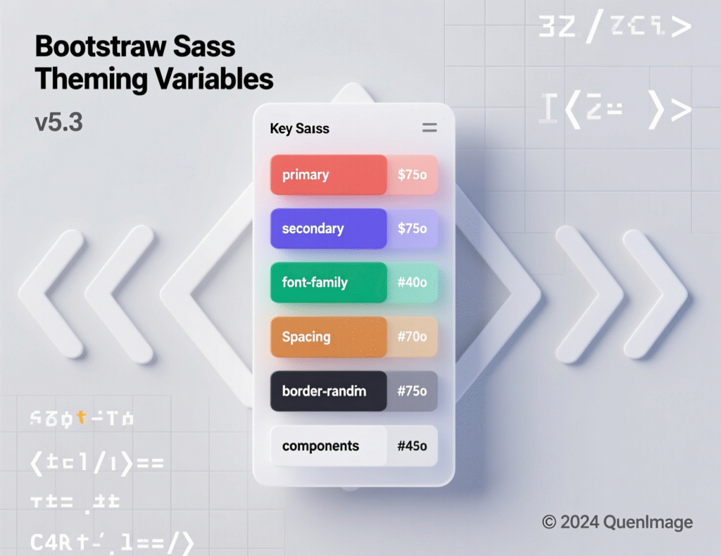
Use color and spacing maps to keep systems consistent across components; remember maps in Sass are immutable (you create new maps on update), which helps avoid accidental side effects.
Example
Define a $theme-colors map that includes brand-specific keys (e.g., brand-secondary, brand-accent) and use mixins to generate utility variants systematically.
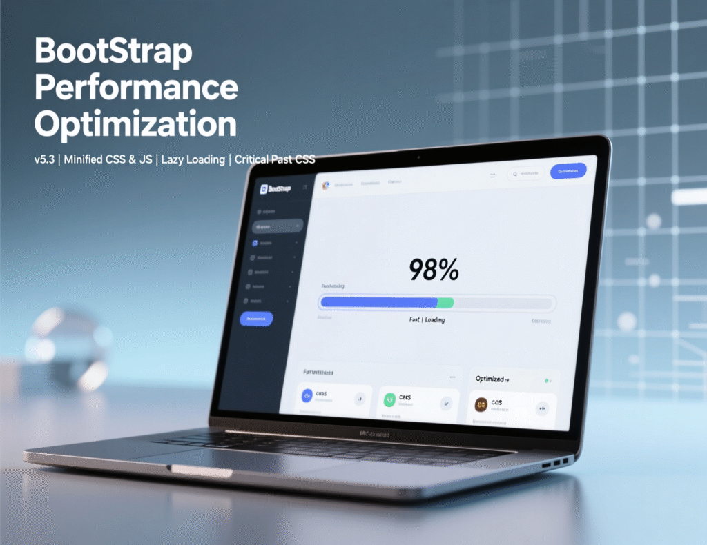
Partial Builds: Tree-Shaking Components for Performance
You don’t have to ship everything. Include only the SCSS partials you need e.g., functions, variables, mixins, grid, buttons, forms then omit less-used components to trim CSS. Similarly, import only the JavaScript modules you actually use. For JS, modern bundlers support tree shaking to drop unused code, reducing payload and improving PageSpeed metrics.
Example import (SCSS)
Run PageSpeed Insights to confirm size and FCP gains after pruning.
Maintaining Design Consistency with a Token System
Create a small design-token layer in Sass colors, spacing scale, type ramp, shadows and map them to Bootstrap variables. This ensures a single source of truth that marketing, product, and engineering all share. Sass maps and mixins make it straightforward to generate utility variants and keep spacing/typography consistent across modules. Reference style guides (e.g., Sass Guidelines) to standardize naming and organization.
Pros & Cons for Business Websites
Speed, Consistency, Community Ecosystem (Advantages)
Speed to market
Prebuilt components and utilities accelerate MVPs and campaign pages.
Consistency
A shared grammar for layout and UI that scales across teams.
Ecosystem
Star count, forks, and vast community resources (themes, snippets, tutorials) reduce risk and onboarding time.
Real-world example
Marketing teams often launch a microsite in days, not weeks, by leveraging cards, navbars, and forms without reinventing base styles.
Risks: “Bootstrap Look,” Bloat, Overriding Conflicts (Drawbacks)
Generic aesthetic
If you only use defaults, sites can look familiar.
Potential bloat
Shipping all components/utilities increases CSS/JS size.
Override complexity
Excessive overrides or mixing ad-hoc utilities with custom CSS can create maintenance debt.
Mitigation
Start with a tokenized theme in Sass, compile partial builds, and measure with Lighthouse trim unused CSS/JS and align design tokens early.
Decision Matrix: Bootstrap vs. Custom CSS for Your Use Case
| Criterion | Bootstrap | Custom CSS |
|---|---|---|
| Speed to MVP | Fast via components/utilities | Slow–Medium, all bespoke |
| Branding | Medium (needs theming to stand out) | High (full control) |
| DX & Hiring | Easy (larger talent pool) | Medium (framework-specific) |
| A11y Baseline | Good starting point + audits | Varies by team |
| Bundle Size | Medium → Low with partials | Potentially Lowest (careful engineering) |
Bootstrap vs. Alternatives
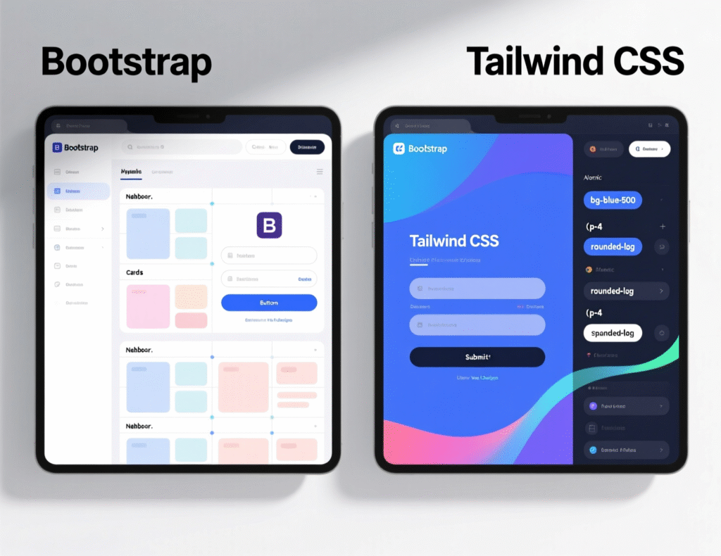
Bootstrap vs. Tailwind for Business Sites
Bootstrap: Components + utilities, structured defaults; great for speed and consistency.
Tailwind: Utility-first with minimal opinions; great for bespoke design systems and low CSS when paired with purge tooling. Tailwind also follows a mobile-first breakpoint model similar to Bootstrap. ROI decision: choose Bootstrap for “assemble fast with components,” Tailwind for “compose unique visuals with utilities.
Bootstrap vs. Material UI
Material UI (MUI) provides React components aligned to Google’s Material Design language ideal for app-like UIs with opinionated patterns (e.g., surfaces, elevation, motion). Bootstrap is more design-agnostic and works with any stack (HTML-first, plus plugins). If you want Material’s aesthetic and React-first components, MUI fits; if you need straightforward HTML/CSS/JS with minimal lock-in, Bootstrap excels.
Templates vs. Custom Build: Time-to-Market vs. Differentiation
Templates (e.g., Start Bootstrap, Bootstrap Studio-exported themes)
fastest launch, predictable layouts, and a good base for non-mission-critical sites.
Custom Build
highest differentiation and control over tokens, components, and performance budgets best for brand-led companies. A hybrid approach start from a reputable template, then layer in tokens and partial builds is often pragmatic.
Buyer tip
Regardless of approach, keep the CI pipeline running Lighthouse and PageSpeed checks to prevent regressions in performance and accessibility.
Hiring & Services: Getting It Built Right
Agency vs. Freelancer vs. Marketplace
Agency (e.g., ScienceSoft, Softura, Netguru, Moravio)
End-to-end delivery, PM, QA, design system setup best for complex scopes or regulated industries. Expect higher rates, but stronger governance and continuity.
Freelancer
Cost-effective, flexible, ideal for well-defined features or smaller sites. Success depends on your internal PM and QA.
Marketplace (Toptal, Upwork, Proxify)
Curated or self-serve pools. Toptal is premium; Upwork has a wide rate band; Proxify offers vetted developers on flexible terms.
Rates, Timelines, and Scopes for Typical Projects
US/EU reference bands (Nov 2025)
Freelance front-end (Upwork)
typically $15–$35/hr for front-end, $15–$50/hr for general web dev; senior specialists price above these bands.
Curated networks (Toptal)
commonly $60–$150+/hr depending on seniority and stack.
Staffing platforms (Proxify)
from roughly €31.90/hr (≈$34+) with quick matching.
Timelines (typical)
Marketing site (5–8 pages): 2–4 weeks with Bootstrap + Sass theming.
App-like site with forms/tables/auth
4–8 weeks depending on integrations.
Use Lighthouse as a quality gate at each sprint; aim for 90+ on Performance and Accessibility before launch.
Geo cues
NYC/London rates trend high; Austin/Berlin slightly lower; near-shore options in Central/Eastern Europe can reduce cost while maintaining quality 2025 rate guides show softening prices in several regions.
How to Vet a Bootstrap Portfolio: Accessibility, Performance, Code Hygiene
Checklist
Accessibility
Passes keyboard navigation, visible focus, alt text, ARIA where needed; evidence of WCAG AA audits.
Performance
Evidence of tree-shaken bundles, partial SCSS builds, Lighthouse reports.
Code hygiene
Tokenized Sass, consistent variables/maps, minimal overrides, semantic HTML, and component reuse.
Ask for
Before/after metrics (PageSpeed URLs), a custom.scss excerpt showing token mapping, and a component sample audited against WebAIM’s checklist.
Summary & Key Takeaways
Use Bootstrap
When speed, stability, and multi-device consistency matter more than maximal visual uniqueness.
Make it responsive
With the grid/utility approach; verify gains with Lighthouse.
Customize with Sass: define tokens, override variables up front, import only what you need, and tree-shake JS.
Avoid bloat
By pruning components and measuring bundle impact via PageSpeed.
Hire wisely
Pick agencies for complex scopes; marketplaces for flexible staffing; vet portfolios for a11y, performance, and clean Sass architecture.
Need a fast, on-brand Bootstrap site that scores 90+ on Lighthouse? Mak It Solutions can design your tokens, theme Bootstrap with Sass, and ship a responsive build measured and documented. Get a free consultation today or contact us through the form below to discuss scope, timeline, and budget.(Click here)
FAQs
Q : Is Bootstrap still relevant in 2025 for business websites?
A : Yes. Bootstrap remains widely adopted and actively maintained, with ~174k GitHub stars and millions of dependent projects evidence that teams still rely on it for production work. For business sites, its component library and responsive grid shorten time-to-market, while an active ecosystem reduces hiring risk. If you need rapid, consistent execution across devices, Bootstrap is a safe choice; if ultra-unique visuals or the smallest possible CSS are critical, consider Tailwind or a custom design system.
Q : How do I avoid the “Bootstrap look” and keep branding unique?
A : Start with a Sass token layer (colors, typography, spacing, radii), override Bootstrap variables, and compile a custom build. Replace default components’ styles selectively, and create bespoke patterns where needed. Use imagery, motion, and illustration that reflect your brand. The key is to design tokens first, not after you build. Then, keep utilities for layout but style components via tokens to prevent ad-hoc overrides and maintain consistency long-term.
Q : Does Bootstrap slow down websites? How to optimize bundle size?
A : Bootstrap itself doesn’t have to be heavy. The bloat risk comes from shipping everything. Solve it by importing only required SCSS partials, tree-shaking JS, and deferring non-critical resources. Measure results with Lighthouse and PageSpeed Insights and prune unused CSS. We routinely see measurable FCP/TTI improvements after partial builds and JS tree shaking
Q : Can Bootstrap meet WCAG AA accessibility requirements out of the box?
A : Bootstrap provides a solid baseline, but compliance is achieved by how you implement. Follow the WebAIM WCAG checklist, ensure proper semantics, labels, and focus states, and apply WAI-ARIA Authoring Practices for custom patterns. Validate with automated checks (Lighthouse) and manual keyboard testing. Bootstrap helps, but the developer and QA practices make the difference in meeting AA.
Q : What should I include in a Bootstrap project brief for an agency?
A : Define goals, pages, and key user journeys; brand tokens (colors, type, spacing); accessibility target (WCAG AA); performance budget (e.g., CSS < 150 KB, JS < 200 KB for above-the-fold); integration requirements; analytics/events; and acceptance criteria (Lighthouse ≥ 90 for Performance & Accessibility). Include reference sites and a content plan. Ask for partial SCSS build strategy and a CI step that runs Lighthouse/PageSpeed on each commit.
Key Takeaways
-
Bootstrap = fast, reliable, component-rich; perfect for many business sites.
-
Use grid + utilities for responsive wins; verify with Lighthouse.
-
Theme via Sass tokens, compile partial builds, and tree-shake JS to avoid bloat.
-
Choose providers by scope: agencies for complex builds, marketplaces/freelancers for targeted tasks; know 2025 rate bands.
-
Bake in accessibility and performance from day one; audit against WCAG and WAI-ARIA.
References (selected)
-
Bootstrap docs: Grid, Breakpoints, Sass, Optimize.
-
GitHub repository (stars, forks, releases, “Used by”)
-
Lighthouse / PageSpeed Insights.
-
WebAIM WCAG checklist & WAI-ARIA APG.
-
Tailwind responsive design docs.
-
Hiring rates: Upwork, Toptal, Proxify, market trends.