
Arabic UX Design Fixes for GCC RTL Websites
Arabic UX Design Fixes for GCC RTL Websites

Arabic UX Design Fixes for GCC RTL Websites
Arabic UX design can directly affect conversion rates across Saudi Arabia, the UAE, and Qatar. When Arabic experiences feel translated instead of truly native, users hesitate, forms become harder to complete, and checkout journeys lose momentum. The biggest problems usually come from broken RTL logic, weak Arabic readability, confusing bilingual flows, and missing trust signals.
Many websites in Riyadh, Dubai, and Doha still look Arabic on the surface but behave like English-first products underneath. That gap is where friction starts. Users may not always explain what feels off, but they notice it quickly through awkward navigation, clumsy forms, or checkout steps that do not feel natural in Arabic.
In GCC markets, Arabic UX design is not just a language issue. It affects trust, usability, and revenue.
What Arabic UX Design Really Means in GCC Markets
It is more than translating text
Strong Arabic UX design starts with behavior, not copy replacement. Arabic users scan content, compare options, and move through pages within a right-to-left mental model. That influences navigation, content order, CTA placement, and even where reassurance messages should appear.
A layout can be visually mirrored and still feel wrong. That usually happens when the interface keeps English-first interaction logic under an Arabic layer.
Why Saudi, UAE, and Qatar users do not respond the same way
Saudi users often expect more direct Arabic-first journeys, especially in mobile commerce, services, and fintech. UAE users are generally comfortable switching between Arabic and English, but they still notice when the Arabic version feels secondary. In Qatar, smoother bilingual handling tends to matter more in finance, public-sector, and trust-sensitive journeys.
That is why one bilingual template rarely performs equally well across all three markets.
How RTL affects trust and action
RTL is not only about right alignment. It shapes comfort and flow. When menus, spacing, typography, arrows, and interaction patterns feel natural, users move faster. When they do not, hesitation builds.
That hesitation hurts conversion long before a user decides to leave.
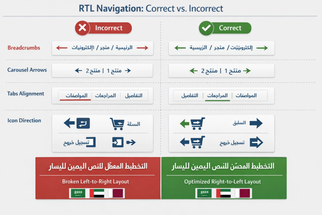
Common RTL UX Mistakes That Hurt Conversions
Fake mirroring
One of the most damaging mistakes in Arabic UX design is fake mirroring. A team flips the layout direction, but filters, progress steps, search behavior, and dashboard logic still follow English patterns.
Users feel the mismatch immediately. The page may look Arabic, but the experience does not feel built for them.
Confusing arrows, icons, and carousels
Arrows, breadcrumbs, sliders, carousels, and tabs often stay left-to-right even on Arabic pages. These details look small in design reviews, but on real user journeys they create hesitation.
This becomes especially costly on mobile, where users make faster decisions and rely on visual direction more heavily.
Mobile layouts that break Arabic readability
In the GCC, mobile traffic dominates many retail, government, and service journeys. That makes Arabic mobile UX critical. Buttons that wrap poorly, cards with tight spacing, sticky elements covering text, or weak visual hierarchy can quickly increase bounce and drop-off.
When paid campaigns send traffic to Arabic landing pages, those issues become even more expensive.
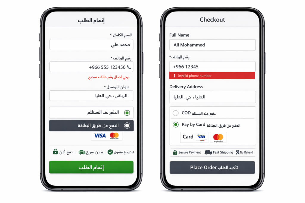
Why Arabic Forms and Checkout Flows Lose Users
Forms that feel unnatural in Arabic
Many Arabic forms still force mixed-direction input in awkward ways. Names, phone numbers, addresses, placeholders, validation messages, and error states can become difficult to scan when the form was originally designed for English.
This is especially risky in Saudi Arabia and Qatar, where users often expect higher clarity in trust-sensitive actions such as registration, payments, or service requests.
Checkout flows with mixed-language friction
A clean-looking checkout can still underperform. If field labels switch languages unpredictably, payment terms sound translated instead of native, or CTA wording feels unclear, users start second-guessing the process.
That is a common issue in Arabic form and checkout design on bilingual GCC e-commerce sites.
Missing reassurance near the action point
GCC users often want reassurance exactly where they are making a decision. That includes payment security, refund clarity, delivery expectations, privacy handling, and support access.
If those trust cues are hidden in footers or buried on separate pages, the interface feels less credible. In practice, small reassurance messages near forms, checkouts, and account actions often improve confidence more than brands expect.
Bilingual UX Mistakes on Arabic-English Websites
English-first hierarchy on Arabic pages
Some websites technically offer Arabic, but the content hierarchy still follows English assumptions. Key value points appear too late. Categories feel unnatural. Important information is buried where Arabic users do not expect to find it.
That creates unnecessary effort, especially for first-time visitors.
Broken language switching
Language switching should preserve the user’s intent. A visitor should not be pushed back to the homepage or to an unrelated page just because they changed languages.
This matters a lot in the UAE, where many users browse in one language and convert in another. If the switch breaks continuity, conversion suffers.
Poor Arabic typography and spacing
Arabic typography needs its own rhythm. Tight line height, weak contrast, poor font pairing, and overly long paragraphs can make Arabic pages feel visually tiring.
Readable Arabic UX depends on more than brand styling. It depends on how comfortably users can scan, compare, and act.
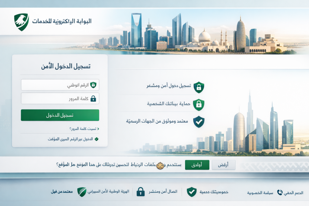
GCC Trust Signals That Influence UX Performance
Compliance context shapes user expectations
In fintech, telecom, logistics, healthcare, and public-facing services, UX and trust are closely linked. Users in the GCC increasingly expect websites and apps to communicate privacy, consent, and security clearly.
Even when users are not thinking about compliance frameworks directly, they do respond to how safe and legitimate an interface feels.
Privacy, data handling, and clarity matter more now
Data residency and privacy messaging are no longer hidden technical topics. Many enterprise buyers and everyday users across the GCC pay more attention to where data is handled, how consent works, and whether policies are explained in a clear way.
From a business point of view, that means UX teams should treat privacy and trust language as part of conversion design, not just legal copy.
Arabic UX supports credibility
A Riyadh fintech startup may need onboarding that feels secure and locally natural. A Dubai e-commerce brand may need bilingual browsing that stays smooth from discovery to payment. A Doha-based service platform may need clearer trust messaging around forms, support, and data handling.
In all of these cases, Arabic UX design becomes part of credibility.
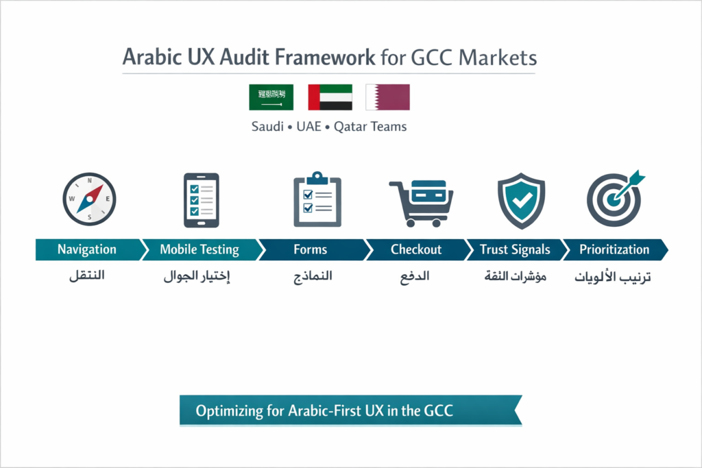
How to Audit Arabic UX Design Before a Redesign
A practical audit usually works best when it focuses on real friction points instead of broad visual opinions.
Start with these areas.
Navigation: Menus, filters, breadcrumbs, tabs, arrows, and search behavior
Forms: Labels, placeholders, validation, error messages, field direction, and input flow
Checkout: Payment wording, billing clarity, trust cues, and CTA labels
Microcopy: Button text, empty states, helper text, and reassurance messaging
Mobile usability: Card spacing, tap targets, scroll behavior, and readability
Then test Arabic-first journeys with real users where possible. Watching users move through a flow in Riyadh, Dubai, Abu Dhabi, or Doha often reveals more than an internal review ever will.
Prioritize fixes based on three things.
Conversion impact
Trust risk
Implementation effort
That approach usually produces faster wins than jumping straight into a full redesign.
Best Practices for Arabic UX Design in the GCC
Build Arabic-first, not Arabic-after
The strongest experiences begin with Arabic flow logic from the start. English can be adapted afterward more easily than Arabic can be repaired later.
Match typography and CTAs to user expectations
Use readable Arabic fonts, natural action labels, and visible trust elements near important decisions. Clarity beats cleverness.
Localize without fragmenting the brand
You do not need separate brands for Saudi Arabia, the UAE, and Qatar. You need one strong design system with room for local nuance in trust cues, content hierarchy, and bilingual behavior.
A Simple Arabic UX Design Review Table
| Area | Common Mistake | Better Approach |
|---|---|---|
| Navigation | Mirrored layout with English-first logic | Design menus and flows for RTL behavior from the start |
| Forms | Mixed-direction fields and awkward validation | Create Arabic-native input patterns and error states |
| Checkout | Unclear payment wording and weak reassurance | Add native Arabic CTAs and trust copy near action points |
| Bilingual UX | Language switch resets journey | Keep users on the equivalent page when switching |
| Typography | Tight spacing and poor readability | Use Arabic-friendly line height, contrast, and hierarchy |
Concluding Remarks
If your site is getting Arabic traffic but not converting as well as expected, the problem may not be your offer or your ad spend. It may be the experience itself. Arabic UX design has a direct impact on trust, clarity, and conversion across Saudi Arabia, the UAE, and Qatar.
Brands that treat Arabic as a native product experience, not a translated layer, usually create smoother journeys and stronger results. That is where better leads, better completion rates, and better customer confidence often begin.( Click Here’s )
FAQs
Q : Is poor RTL design hurting conversions on Saudi websites?
A : Yes, very often. In Saudi Arabia, users usually expect Arabic journeys to feel native from the first interaction to the final action. When menus, forms, and checkouts behave like translated English interfaces, confidence drops quickly.
Q : What matters most for UAE bilingual websites?
A : Smooth language switching, balanced Arabic-English hierarchy, strong Arabic readability, and consistent navigation all matter. Many UAE users move between both languages during a single journey, so the experience needs to stay seamless.
Q : How should checkout pages be localized for Qatar users?
A : They should avoid mixed-direction confusion, unclear labels, and awkward payment wording. Arabic and English should work cleanly together, especially for names, addresses, mobile numbers, and billing details.
Q : What are the fastest Arabic UX fixes before a redesign?
A : The fastest wins usually come from navigation, forms, checkout microcopy, and mobile readability. These are often the places where friction affects conversion the most.
Q : Can one design system work across Saudi, UAE, and Qatar?
A : Yes, but it should allow for localized nuance. The core brand can stay consistent while trust signals, copy emphasis, and bilingual behavior are refined for each market.
[…] Arabic-English websites in the GCC often lose visibility after launch because the setup looks bilingual to users, but search engines still see mixed signals. Multilingual SEO for GCC works best when Arabic and English pages have separate URLs, correct hreflang annotations, and canonicals used only for true duplicates. For businesses targeting Saudi Arabia, the UAE, and Qatar, that structure reduces indexation confusion, protects local relevance, and creates a clearer experience for users searching in both languages. […]