Checkout UX: 10 Micro-Tweaks That Boost Conversion
Checkout UX: 10 Micro-Tweaks That Boost Conversion

Checkout UX: 10 Micro-Tweaks That Boost Conversion
If your revenue is leaking at the last step, you don’t need a total redesign you need targeted fixes to checkout UX. In almost every study, shoppers cite complexity, surprise costs, or friction as reasons to bail. Baymard’s ongoing checkout research shows the average US checkout still exposes far too many form elements by default and that trimming fields alone can meaningfully reduce abandonments. Their 2025 stats note 18% of US shoppers abandoned due to a “too long/complicated checkout” and that the average flow shows ~23.5 elements by default, while an ideal can be 12–14 elements (7–8 form fields) depending on context. Baymard Institute
The upside of improving checkout UX is equally clear: Baymard’s long-running usability work indicates large ecommerce sites can gain roughly 35% conversion by fixing solvable UX issues.
Below are 10 practical micro-tweaks you can ship this sprint each rooted in research and field data.
Make Guest Checkout Unmissable
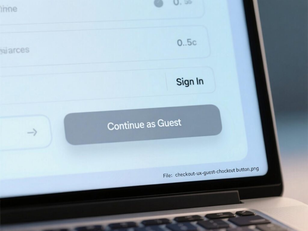
Burying guest checkout forces account creation and kills momentum. Baymard recommends presenting “Guest checkout” as a prominent button (not a link) and placing it first in the account-selection step, particularly on mobile where keyboards can obscure options. This small checkout UX change reduces “where do I click?” friction at the very first decision.
How to ship it this week
Put Guest checkout above Sign in/Create account.
Make it a high-contrast primary button.
Persist the choice if a user navigates backward.
Cut Form Fields to the Minimum (Aim for 8)
Fewer fields, fewer errors, faster purchases. Baymard’s 2024 analysis shows form field count matters more than step count; most sites need ~8 total form fields, while the 2024 average was 11.3—still too high. A major share of abandonments is driven by form complexity. Refactoring this part of checkout UX pays immediate dividends.
Practical trims
Use a single “Name” field.
Hide optional fields behind “Add details”.
Default “Billing = Shipping” with an easy toggle.
Avoid “Apply” buttons for code or selection updates.
Add Address Autocomplete + Validation
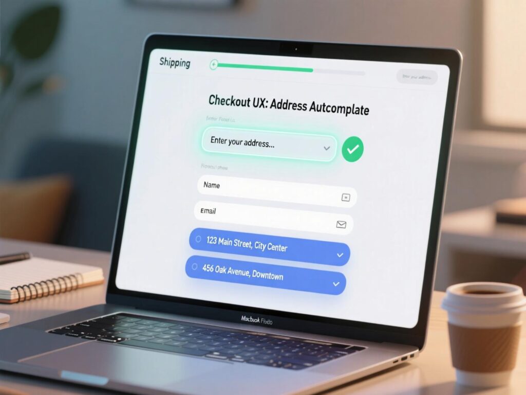
Autocomplete speeds inputs and prevents typos; an address validator catches the rest—critical on mobile. Baymard recently emphasized fully automatic address lookup and noted that 47% of sites don’t offer a validator despite clear benefits. Add both to harden checkout UX and reduce failed deliveries.
Implementation tips
Use a reputable autocomplete (e.g., Places API) with locale bias.
Validate after entry; offer clear, non-blocking corrections.
Respect user intent when they confirm a non-standard address.
Use Inline Validation with Specific Error Copy
“Form failed” after submit is too late. Inline validation (on blur or after a brief pause) prevents rework and confusion. Baymard reports 31% of sites lack inline validation, and their research shows adaptive, field-level guidance gets users unstuck faster—essential to checkout UX.
Do this
Validate email syntax after focus-out; show fix-it hints.
Remove error styles once corrected.
Keep users on the field; don’t jump them around.
Surface Digital Wallets Early (and Default on Mobile)
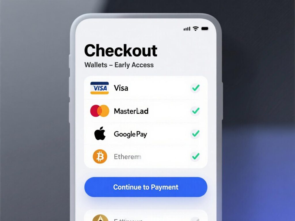
Accelerated wallets remove the heaviest friction: re-typing identity and payment. Stripe’s recent experiment across global businesses found Apple Pay availability correlated with a 22.3% conversion lift; their separate study saw 2× higher conversion when Apple Pay appears earlier via Express Checkout versus being hidden at the end. Shopify’s data shows Shop Pay can lift conversion by up to 50% vs guest checkout and adds a +5% lower-funnel lift by presence alone. Presenting wallets prominently is a simple checkout UX win.
Placement
Show wallet buttons at the first step (top on mobile).
Back them with a “Pay with card” secondary choice.
Use device detection to prioritize Apple Pay/Google Pay accordingly.
Add a Clear Progress Indicator
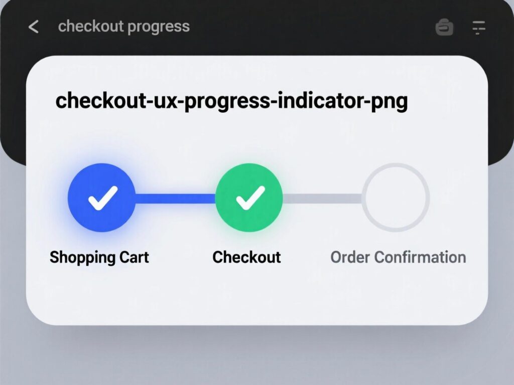
A concise “1–2–3” or labeled steps reduces uncertainty. Though specifics vary by flow, multiple UX teams and practitioners recommend visualizing steps to set expectations and lower anxiety—helpful for checkout UX especially on longer flows.
Guidelines
Show current step, remaining steps, and ETA where possible.
Don’t inflate steps; group logically (Shipping → Payment → Review).
Keep the “Continue” CTA consistent in label and location.
Be Upfront About Costs and Delivery Dates
Surprise fees cause rage-quit. Show shipping costs, taxes (or estimates), and “delivers by” dates before users reach payment. Baymard’s 2024 update added guidance to include all fulfillment options in the selector interface, reinforcing transparency as a core checkout UX principle.
Nudge confidence
Show “Order summary” sticky with total that updates live.
Offer pickup/in-store options inline where applicable.
If estimates vary, explain why in concise microcopy.
Place Security Cues Where It Matters (Without Clutter)
Trust signals must be contextual. CXL’s original research found security badges influence perception on checkout pages especially near payment fields yet clutter or outdated seals can backfire. Keep a lock icon, short “256-bit SSL” note, and card-network marks by the payment UI. This subtle checkout UX reassurance helps nervous buyers.
Keep it clean
Avoid a wall of badges; prioritize clarity over quantity.
Don’t mix conflicting messages (e.g., “secure” next to error states).
Maintain pixel-perfect alignment—sloppiness erodes trust.
Design for Mobile Ergonomics and Speed
Most checkouts are mobile-first by traffic, desktop-first by design. Fix that. Improve checkout UX with NUM keypad for numeric inputs, auto-advance for card fields, and large tap targets. Preload the next step and use skeletons to mask latency. Avoid unexpected page jumps (CLS), and keep CTA fixed at the bottom on small screens.
Quick wins
Input modes:
inputmode="numeric"for card/ZIP/phone.Autofill &
autocompleteattributes across fields.Keep primary CTA bottom-fixed; secondary links de-emphasized.
Persist Everything (Especially After Errors)
Few things are more demotivating than re-typing. Baymard found 34% of sites don’t retain card numbers on error, directly causing abandonments. Persist carts, shipping addresses, and as many payment details as policy allows (masking securely). This single safeguard strengthens checkout UX dramatically.
Implementation tips
Save draft checkouts to localStorage + server.
Preserve form values across refresh/back navigation.
On error, keep inputs and focus the problem field with help text.
A simple framework to prioritize
Start with the biggest friction per effort:
Visibility changes (guest button, wallet placement).
Field reduction + inline validation.
Transparency (costs, delivery) and speed (autocomplete, performance).
This keeps checkout UX work scoped, shippable, and measurable in weekly increments.
Two quick case snapshots
Case A (Wallets early)
A global brand moved Apple Pay and Google Pay to the top of step 1 and saw a marked lift among eligible devices. Stripe reports that showing Apple Pay earlier via their Express Checkout doubled conversion versus burying it at the end; expect similar directional impact if you currently hide wallets
Case B (Accelerated checkout)
Shopify cites an external study concluding Shop Pay can lift conversions by up to 50% vs guest checkout and adds ~5% lower-funnel uplift simply by being present. If your stack supports it, test accelerated options side-by-side.
These are not silver bullets, but they’re reliable force multipliers for checkout UX when paired with field reduction and validation fixes.
Measuring the impact (and avoiding false positives)
Primary KPI: Checkout completion rate (sessions that started checkout → orders).
Secondary: Step-to-step drop-offs, time-to-complete, error rate per field, wallet share, authorization rate.
Experiment design: Run A/Bs at full funnel parity; avoid overlapping tests; segment by device/payment eligibility.
Quality guardrails: Monitor decline codes, fraud, and chargebacks when adding new methods—conversion without authorization is a mirage.
A disciplined approach ensures checkout UX lifts are real, not seasonal noise.
Accessibility and localization notes
Labels must remain visible (don’t rely on placeholders).
Color contrast ≥ WCAG AA; error text not just red.
Respect locale formats (name order, postal codes).
Wallet availability varies by region/device feature-flag accordingly to keep checkout UX consistent globally.
To Sum Up
You don’t need a quarter-long rebuild. Make guest checkout obvious, cut fields, validate inline, move wallets up, and remove surprises around price and delivery. These “micro-tweaks” compound into a clear, fast, trustworthy checkout UX. Start with two changes this week, measure, then stack improvements. With a clear backlog and disciplined testing, your checkout UX becomes a durable revenue engine not a leaky funnel.
CTA: Want a prioritized, 2-week checkout UX audit with annotated fixes and A/B test plans? Book a free assessment today.
FAQs
Q: How do I decide which checkout UX tweaks to do first?
A : Prioritize by impact × effort: guest checkout visibility, field reduction, and wallet placement typically win fastest. Validate with a short A/B and track step-wise drop-offs to confirm. Baymard’s findings emphasize field reduction’s outsized effect.
Q : How many steps should my checkout have?
A : Step count matters less than work per step. Two to three labeled steps are fine if each is light. The bigger lever is cutting fields to ~8 and reducing cognitive load.
Q : How can address autocomplete improve conversion?
A : It speeds entry and reduces shipping failures from typos. Pair autocomplete with a validator for edge cases; many sites still lack one.
Q : How does accelerated checkout affect conversions?
A : Digital wallets and Shop Pay can significantly lift conversion, especially on mobile—Stripe and Shopify report material uplifts when surfaced early.
Q : How can I reduce errors during checkout?
A : Use inline validation, specific error copy, and preserve inputs after failed submits. This keeps users moving and avoids re-typing.
Q : How do progress indicators help?
A : They reduce uncertainty and perceived effort, improving completion on longer flows when done cleanly.
Q : How transparent should I be with fees and delivery?
A : Entirely. Show totals (or estimates) and delivery dates early; Baymard’s guidance prioritizes clear, inline fulfillment options.
Q : How can trust badges help (and hurt)?
A : Placed near payment fields they can reassure; overuse or messy layouts harm credibility. Keep it minimal and pixel-perfect.
Q : How do I measure the ROI of checkout changes?
A : Use lift in completion rate, faster time-to-complete, lower error rates, and improved authorization. Tie to revenue per session and average order value to quantify.
