
Color Psychology
Color isn’t decoration it’s direction. From a red “Buy Now” button that screams urgency to a calm blue interface that earns trust, color psychology shapes attention, emotion, and choice at every stage of a journey. Decades of research show that color can influence affect, cognition, and behavior, especially when meanings are tied to context (e.g., warnings, status, or social signals).
In this guide, you’ll learn the universal patterns that persuade, where they hold up across cultures, where they shift, and how to deploy them in branding, advertising, and UX without drifting into cliché or accessibility debt. We’ll map the most reliable associations by hue, share quick wins you can test in days, and give you a step-by-step plan to run ethical, data-driven color experiments that improve conversions and satisfaction without sacrificing readability or inclusivity. PubMed
What Is Color Psychology?
Color psychology studies how perceiving color can affect what people feel, think, and do. Modern evidence indicates that color carries meaning (e.g., danger, competence, purity) and can change behavior when presented in the right context—think red as a warning in tests, or blue as steady competence in finance and tech interfaces. These effects aren’t magical; they’re learned, contextual, and partly biological, which is why the same hue can nudge different outcomes in different settings.
Why Color Persuades: The Science in Brief
Associations
People reliably link colors with emotions (e.g., yellow-joy, black-sadness; light = positive, dark = negative). These associations appear systematic in a large body of studies across 1895–2022.Context matters
“Red” can impair performance in achievement contexts (warning/avoidance) yet increase attention/urgency in shopping or alerts. The meaning you prime shapes the effect.Category fit
Colors signal brand traits e.g., blue → competence/trust, red → excitement/energy which can strengthen positioning when they fit the category and audience.Modern nuance
Recent work shows color-emotion links are often combinational (hue + saturation + lightness), not just single-hue clichés. That means micro-tuning shade and brightness matters.
Universal Patterns by Hue (and When They Persuade)
Tip
Think “hue + saturation + lightness + contrast.” Stronger saturation and higher contrast spike attention; carefully chosen lightness supports accessibility and tone.
Red Urgency, Salience, Risk
Persuasive uses
Flash sales, error states, alerts, countdowns, limited-time CTAs.Evidence
Across CRO case studies, red CTAs have outperformed green in some contexts (e.g., +21% clicks in a HubSpot test; multi-study roundups at CXL). Use judiciously; overuse can feel stressful.Pitfalls
Avoid red for success states; be cautious in medical or financial forms.
Blue Trust, Competence, Calm
Persuasive uses
Fintech dashboards, B2B SaaS, security/privacy messaging, onboarding.Evidence
Marketing research consistently positions blue as competent/reliable.Pitfalls
Overuse can feel cold; warm accents (orange/teal) add approachability.
Green Permission, Growth, Safety
Persuasive uses
“Continue/Proceed” buttons, sustainability messaging, wellness apps.Notes
Performs well for success states and ecological narratives; avoid green error text (colorblind risks).
Yellow Attention, Optimism, Caution
Persuasive uses: Price badges, highlights, educational tips.
Pitfalls: Low contrast on white; pair with strong dark text.
Orange Energy, Friendly Action
Persuasive uses: Primary CTAs in retail, onboarding nudges, limited-stock notices.
Notes: Balanced between red’s urgency and yellow’s optimism—often a high-CTR accent in e-commerce.
Purple Creativity, Premium, Imagination
Persuasive uses: Creative tools, cosmetics, wellness, luxury tiers.
Notes: Works best as an accent; deep purples can skew “mysterious.”
Black / White / Gray Authority, Clarity, Neutrality
Persuasive uses
Luxury/editorial layouts (black), minimalist product pages (white), neutral backgrounds (gray).Notes:
Contrast rules apply test legibility across devices and modes.
Color Psychology in UX & CRO (Fast Wins)
Make CTAs contrast-dominant
Choose a brand-distinct CTA color that stands apart from backgrounds and secondary UI.
Map color to state
Success = green; warning/error = red; informational = blue. Keep it consistent across flows.
Reserve red for “must-notice”
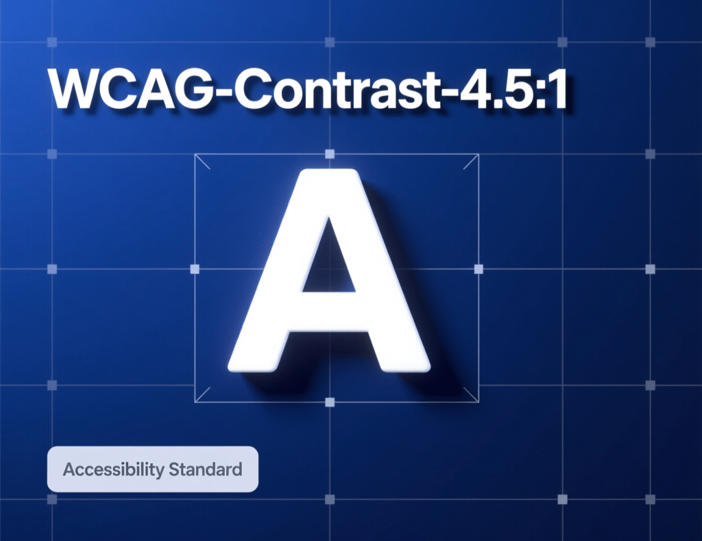
Moments: Too much red causes fatigue. Use sparingly for the highest-priority actions or alerts. Evidence from CRO communities shows red can outperform green for primary CTAs, but only when red is the higher-contrast, more isolated choice in the layout. Respect accessibility: WCAG Level AA requires 4.5:1 contrast for normal text (3:1 for large text). Use a contrast checker before shipping.
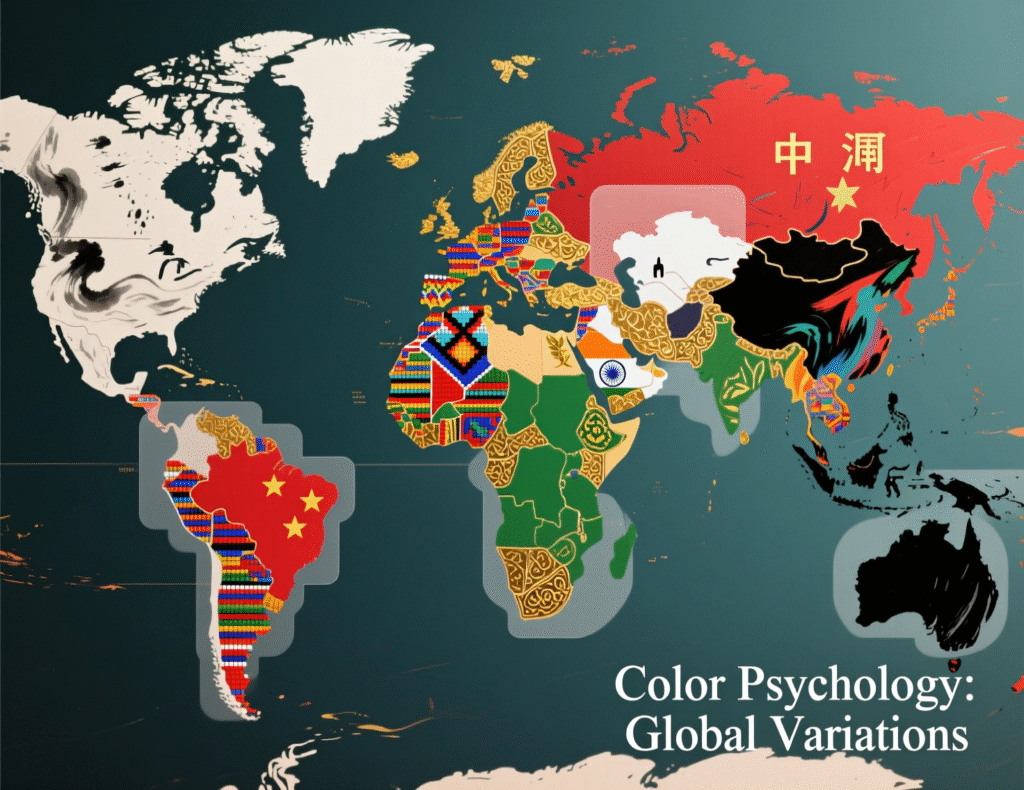
Context & Culture: When Meanings Shift
Color meanings are not completely universal. Traffic-signal conventions, school colors, religious symbolism, and regional media shape associations. Research still finds recurrent mappings (e.g., light = positive) while acknowledging variability, which is why test-in-context beats generic “color rules.” Plan locale-specific experiments when stakes are high (e.g., pricing pages, checkout).
How Color Psychology Persuades in Branding
Positioning fit
Choose hues that reinforce your core trait (e.g., blue for competent fintech, red/orange for energetic D2C).Portfolio logic
Assign systematic roles primary brand hue, CTA accent, status colors—so your ecosystem feels coherent.Shade matters
Adjust saturation/lightness to navigate between “bold” and “calm” without losing recognizability.
How to Test Color Psychology in Your Funnel (Step-by-Step)
Pick a single decision point
e.g., product page CTA.
Form a directional hypothesis
“An orange CTA (higher contrast vs. layout) will increase clicks vs. current gray.”
Isolate variables
Only change color; keep copy/size/placement the same.
Pre-check accessibility
Ensure AA contrast before testing.
Choose metrics
Primary = CTR; Guardrail = bounce, time on page, error rates.
Run an A/B test
Minimum 2 full business cycles; stop at pre-registered power.
Segment & sanity-check
New vs. returning, mobile vs. desktop, dark-mode users.
Document learnings
Update your design tokens and usage notes.
Two Short Case Studies (Applied Examples)
Case A Retail CTA Uplift
A lifestyle retailer switched its product-page CTA from green to red. The new button contrasted more strongly with the brand’s teal backgrounds and was visually isolated. Result: a double-digit lift in CTR (similar to the +21% change observed in a HubSpot A/B) with no rise in returns. Lesson: contrast + isolation, not “red magic,” drove the effect.
Case B Fintech Trust Lift
A fintech onboarding flow moved from a neon palette to muted blues with green success states. Support tickets about “security concerns” dropped, and completion rates rose over two sprints. This mirrors research connecting blue with competence/trust, especially when copy emphasizes reliability and privacy.
Common Pitfalls (and How to Avoid Them)
Color-only signaling
Don’t rely on color alone for meaning—add icons, labels.Low contrast
Light yellows on white look modern…and unreadable. Follow 4.5:1 AA minimums.Palette sprawl
Limit primary brand hues, give CTAs a unique accent, and standardize status colors.Assuming universals
Validate in each market; borrow patterns, but test, don’t transplant.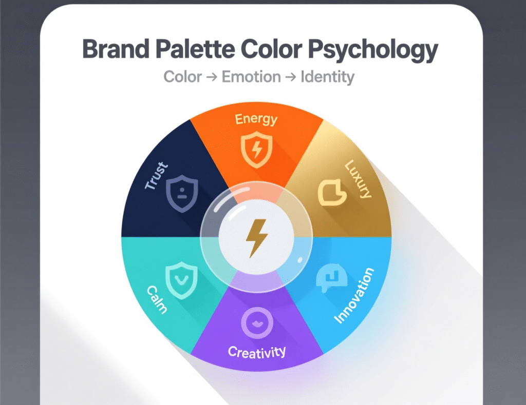
Concluding Remarks
Color is a persuasive instrument powerful when tuned to context, contrast, and category fit. The most durable findings in color psychology point to reliable emotional associations and brand trait signals, but the biggest gains come from rigorous testing within your own journeys. Pair a coherent brand palette with accessible contrast and controlled A/B tests, and color will do more than decorate—it will direct attention, reinforce trust, and improve the choices people make on your site or app.
CTA: Want a quick, evidence-based color audit? Ask for a 30-minute palette and CTA review—we’ll map contrast, accessibility, and test ideas you can ship this week.
FAQs
Q1) How does color psychology actually influence conversions?
A: By shaping attention (contrast/salience), emotion (associations), and perceived brand traits (e.g., blue → competence). Effects strengthen when the color fits the context and category and when contrast is high enough to improve noticeability.
Schema expander: Emphasize context, contrast, and category fit; avoid color-only signaling.
Q2) How can I pick a CTA color that works globally?
A: Select a hue that’s distinct from your brand background and aligns with your positioning. Ensure AA contrast, test in two or three high-traffic markets, and monitor segment results. Avoid relying solely on “red beats green” folklore.
Schema expander: Recommend A/B test with accessibility pre-check.
Q3) How do I test color psychology without biasing results?
A: Change one variable at a time (hue), pre-register sample sizes, and run long enough to cover buying cycles. Keep copy, size, and placement constant.
Schema expander: Include guardrail metrics and segment analysis.
Q4) How does culture affect color meanings?
A: Core patterns appear across studies (e.g., light = positive), but local symbols can invert meanings. Validate in-market; don’t assume transferability.
Schema expander: Suggest locale-specific A/B tests.
Q5) How is contrast different from color choice?
A: Contrast is about luminance difference, not just hue. High-contrast CTAs get noticed faster and meet accessibility standards (4.5:1 for normal text).
Schema expander: Provide checker link and thresholds.
Q6) How many brand colors should I use?
A: A practical system: 1–2 brand primaries, 1 action color (CTA), and a small set for states (success, warning, error).
Schema expander: Document in design tokens.
Q7) How do dark mode and color psychology interact?
A: Dark backgrounds change perceived contrast and saturation. Re-test CTAs and status colors in dark mode, and confirm AA contrast in both themes.
Schema expander: Note different contrast perception at night/AMOLED.
Q8) How can color psychology reduce friction in forms?
A: Use consistent state colors (green for success, red for errors), high-contrast labels, and supportive blues for info/help—improves clarity and completion.
Schema expander: Map to errors, help text, and success feedback.
Q9) How can I use Google Trends and Keyword Planner here?
A: Trends reveals rising interest in topics like “color psychology”; Keyword Planner validates query volume by region and language for your SEO plan. (Accessed Oct 4, 2025.)