
B2B Landing Page Framework for IT Growth
A strong b2b landing page framework helps IT services companies turn qualified traffic into better leads. Instead of sending buyers to a generic service page, it gives them the right message, proof, and CTA in the right order.
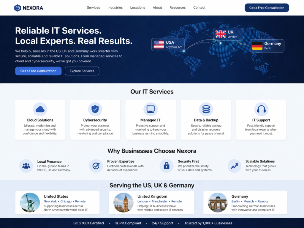
For B2B IT buyers, that matters. They are not making impulse decisions. They are comparing vendors, checking risk, reviewing compliance expectations, and looking for signs that your team understands their environment. A landing page framework makes that evaluation easier and gives your business a more consistent way to convert traffic across the USA, UK, Germany, and the wider EU.
What Is a B2B Landing Page Framework?
A b2b landing page framework is a repeatable page structure built to support one audience, one offer, and one conversion goal. It connects buyer pain points, service outcomes, trust signals, and CTA flow in a way that feels clear and low-friction.
That is different from a homepage or a general service page.
A homepage introduces your company.
A service page explains what you do.
A landing page is tighter. It is built for a campaign, search intent, or a specific buyer segment.
For IT services, that might mean separate landing pages for.
Managed IT support
Cyber security assessments
Cloud consulting
Infrastructure modernization
SaaS integrations
IT helpdesk services
The point is not to say more. The point is to say the right things in the right sequence.
Why IT Services Need a Clear Landing Page Structure
IT buyers usually carry more decision risk than buyers in many other industries. They are often thinking about uptime, security, compliance, scalability, vendor reliability, and internal stakeholder approval all at once.
That is why random page design usually underperforms.
A framework-led page gives them.
Faster clarity on what you offer
Stronger message match with their problem
Earlier proof and trust signals
One obvious next step
Less friction in the conversion path
When the structure is right, the page feels easier to trust. That alone can improve lead quality.
The Core Sections in a High-Converting B2B Landing Page Framework
Most high-performing pages follow a simple structure. The exact wording changes by audience, but the flow stays consistent.
Hero section with clear value proposition
Your hero should answer three things fast.
Who is this for?
What problem do you solve?
What should the visitor do next?
For example, an IT support page for healthcare should not open with vague language like “future-ready digital solutions.” It should sound more direct and specific.
Something like:
Secure managed IT support for growing healthcare teams that need reliability, compliance awareness, and faster issue resolution.
That is clearer. It speaks to the buyer’s reality.
Pain-point alignment
After the hero, show the visitor you understand their day-to-day friction.
For IT buyers, that often includes.
Slow response times
Security concerns
Poor vendor communication
Cloud visibility gaps
Compliance pressure
Internal resource constraints
This section works best when it sounds like the customer, not like a brochure.
Outcomes-focused service blocks
Do not dump features too early. Show outcomes first.
Buyers care about what changes after they hire you.
Faster support resolution
Better endpoint visibility
Lower operational risk
Cleaner cloud governance
Smoother onboarding
More stable infrastructure
Features still matter, but they work better when they support a clear result.
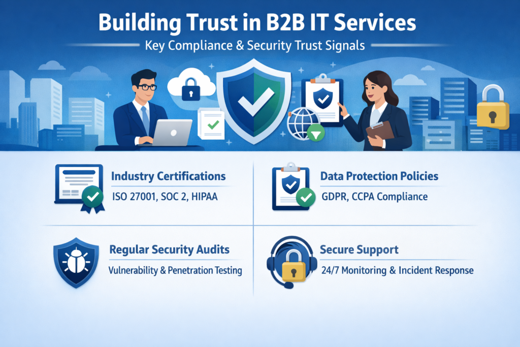
Proof and trust signals
This is where many IT landing pages lose momentum. They wait too long to prove credibility.
Bring trust signals in early, such as.
Client logos
Certifications
Case study snippets
Testimonials
Platform partnerships
Relevant delivery experience
For regulated or enterprise-facing offers, trust also includes compliance language where relevant, such as GDPR, UK GDPR, HIPAA, PCI DSS, SOC 2, or ISO 27001.
Primary CTA and form strategy
Every landing page needs one main action.
That CTA might be.
Book a consultation
Request an assessment
Talk to an IT specialist
Get a scoped estimate
Keep the path focused. Too many competing CTAs dilute intent.
Forms should also feel manageable. A short form usually works better at the first conversion step, especially for colder traffic. You can qualify further after the lead comes in.
FAQ and objection handling
A smart FAQ section helps reduce hesitation without making the page feel heavy.
It can answer things like.
How quickly can you onboard?
Do you support regulated environments?
What regions do you serve?
Do you offer project-based or ongoing support?
How do you handle pricing and scoping?
This is also useful for search visibility and answer-focused content formatting.
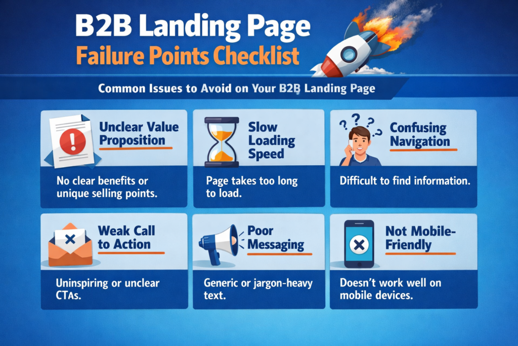
Why Most B2B Service Landing Pages Fail to Convert
Most landing pages do not fail because of design alone. They fail because the structure does not match how buyers evaluate risk and fit.
Here are the most common problems.
Weak positioning
Many pages sound interchangeable. Phrases like “trusted partner” or “innovative solutions” do not create clarity. They sound safe, but they say almost nothing.
Specificity converts better.
Too much company talk
Buyers are not landing on the page to read your internal story first. They want to know whether you solve their problem.
If the first half of the page is about your company instead of their situation, you are making the visitor work too hard.
Proof appears too late
Trust should not be buried near the bottom. In B2B IT services, proof often needs to appear near the top half of the page.
That is especially true for cybersecurity, cloud, compliance-heavy, or enterprise offers.
Forms create friction
Long forms do not automatically improve lead quality. They often just reduce conversion volume.
A better approach is to make the first step easy, then qualify the lead through follow-up.
CTA is vague or scattered
“Learn more” is rarely the strongest CTA for a serious IT service. A more direct next step usually performs better because it reduces uncertainty.
Conversion Tactics That Strengthen Lead Quality
A better b2b landing page framework does more than increase form fills. It helps you attract leads that are more likely to become real opportunities.
Lead with outcomes, not fluff
Your headings should make sense even if someone only skims the page.
Instead of.
Enterprise-grade digital innovation
Try.
Managed IT support that reduces downtime and gives your team faster response times
That is clearer and easier to trust.
Match proof to the buyer
Not all trust signals carry the same weight.
A healthcare buyer may care about compliance awareness and secure systems support.
A fintech buyer may care about data handling maturity.
A mid-market SaaS buyer may care about scalability and integration experience.
The proof should fit the audience, not just fill space.
Test message match before cosmetic changes
If the page is underperforming, start by testing:
Headline
CTA wording
Proof placement
Form length
Offer framing
Do not begin with button colors or minor layout tweaks if the core message is unclear.
How to Localize the Framework for USA, UK, and Germany/EU Buyers
Localization is not only about wording. It is also about trust cues, buying style, and what buyers need to feel comfortable moving forward.
USA.
US buyers often respond well to:
Clear ROI language
Faster time-to-value
Specific specialization
Direct CTAs
For markets like New York or Austin, straightforward messaging usually works better than abstract positioning.
UK.
UK buyers often value.
Delivery clarity
Process maturity
Commercial transparency
Low-friction vendor conversations
For London or Manchester audiences, stable language and practical trust signals can outperform aggressive sales copy.
Germany and the wider EU.
German and EU buyers are often more sensitive to.
Data handling clarity
GDPR or DSGVO awareness
Hosting region transparency
Controller and processor responsibilities
Security and governance language
For Berlin, Munich, Frankfurt, and similar markets, this can be a real conversion factor, not just a compliance footnote.
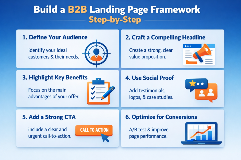
How to Build a B2B Landing Page Framework Step by Step
If you want a practical way to build your own page structure, start here.
Define the audience and intent
Choose one audience and one offer.
A page for a cybersecurity assessment should not try to sell managed helpdesk support at the same time. Keep the page tightly aligned with the traffic source and buyer intent.
Clarify the core promise
Write one strong value proposition that explains.
Who you help
What result you deliver
Why your approach is credible
If this part is vague, the rest of the page will struggle.
Map the sections in buying order
A simple order often works best.
Hero
Pain points
Outcomes
Proof
Compliance or trust signals
CTA
FAQ
Think in terms of decision flow, not internal company hierarchy.
Add proof where doubt appears
Place case studies, testimonials, certifications, and partner logos where the buyer is most likely to hesitate.
That might be.
Under the hero
After the outcomes section
Next to the form
Inside the FAQ area
Keep one primary CTA
Do not overload the page with too many actions.
A page built to drive consultations should keep pointing toward that one next step.
Measure more than conversion rate
A landing page is not successful just because it generates more form submissions.
Track metrics like.
Qualified meetings
Sales-readiness
Opportunity creation
Close-rate influence
That gives you a better picture of whether the page is attracting the right leads.
Final Take
A strong b2b landing page framework helps IT services companies turn interest into qualified conversations by putting the right message, proof, and CTA in the right order. When the page is built around buyer intent instead of generic company claims, it becomes easier for prospects to understand the offer, trust the vendor, and take the next step. That is especially important in IT services, where buyers often compare multiple providers and evaluate risk before they convert.
The best results usually come from pages that stay focused on one audience, one offer, and one conversion goal. With the right structure, IT businesses can improve message clarity, reduce friction, and attract better-fit leads across the USA, UK, Germany, and wider EU markets.( Click Here’s )
Key Takeaways
A strong b2b landing page framework is really about alignment. The page should align with buyer intent, risk concerns, trust expectations, and one clear next step.
For IT services, the best pages are not the ones with the most design elements. They are the ones that make the decision easier.
If your current pages look polished but still underperform, the issue may be structure more than traffic. In many cases, better sequencing, stronger proof, and cleaner CTA flow can make a bigger difference than another design refresh.
FAQs
Q : What is a B2B landing page framework?
A : A B2B landing page framework is a repeatable structure used to guide buyers from interest to action. It usually includes a clear value proposition, pain-point messaging, proof, trust signals, and one focused CTA.
Q : How long should an IT services landing page be?
A : It should be long enough to answer buyer questions and reduce hesitation. Higher-trust offers like cybersecurity, managed IT, or cloud consulting usually need more proof than a simple lead magnet page.
Q : Should B2B landing pages include pricing?
A : Sometimes. If your pricing is standardized, it can help with lead quality. If the scope varies widely, it is often better to explain pricing factors and guide visitors toward a consultation.
Q : Do I need separate landing pages for the USA, UK, and Germany?
A : In many cases, yes. Even when the core service is the same, the trust language and buying expectations often differ by market.
Q : What is the best CTA for an IT services landing page?
A : The best CTA is usually specific and low-friction. “Book a consultation,” “Request an assessment,” or “Talk to an IT specialist” often works better than a generic button like “Learn more.”